

This post is written by MPEX Imaging Specialist Angela Smith. She can be reached at imaging@mpex.com for anything printing or imaging related!

When looking for ways to enhance your creative endeavors with photography do not forget to explore the realm of the photographic print. With endless possibilities in how you can print, what can be printed on, and how your images can be displayed there are countless opportunities to showcase your photographic prowess. One of the mediums to consider is the basic photographic print and the myriad of finishes that are available to experiment with. I was able to get ahold of samples of Ilford Gallerie Prestige so that I could conduct some testing and have some insight on the unique qualities of the line so that I can help anyone decide on what paper best suits their needs.

Ilford took a year hiatus but came back with ramped up production and product even more luminous than before. Coming from a Darkroom background I tested several papers before choosing the Ilford Multigrade Fiber Warmtone Silver Gelatin paper. From focusing my photography on portraiture and the body I instantly fell in love with the warmtone of this paper and how it breathed life into my prints. It had just enough of a warm tone to show life in the skin and yet still wasn’t overwhelming that the viewer would then be distracted from the actual image. With my love of Ilford starting in the darkroom I really wanted to fall in love again with the Gallerie Prestige line.
To test several of the papers I started by creating three various test prints that would be able to showcase the unique abilities to handle various black and white scenarios, and various high color schemes. After creating the test images I was able to download all the ICC profiles associated with the specific Ilford papers from the individual paper profiles listed on the Ilford site. I printed using our newest Epson SureColor P7000 and so there were a couple papers that did not have ICC profiles associated with the newest additions to the Epson line, but check back with Ilford in a little bit and I am sure the profiles will be updated.


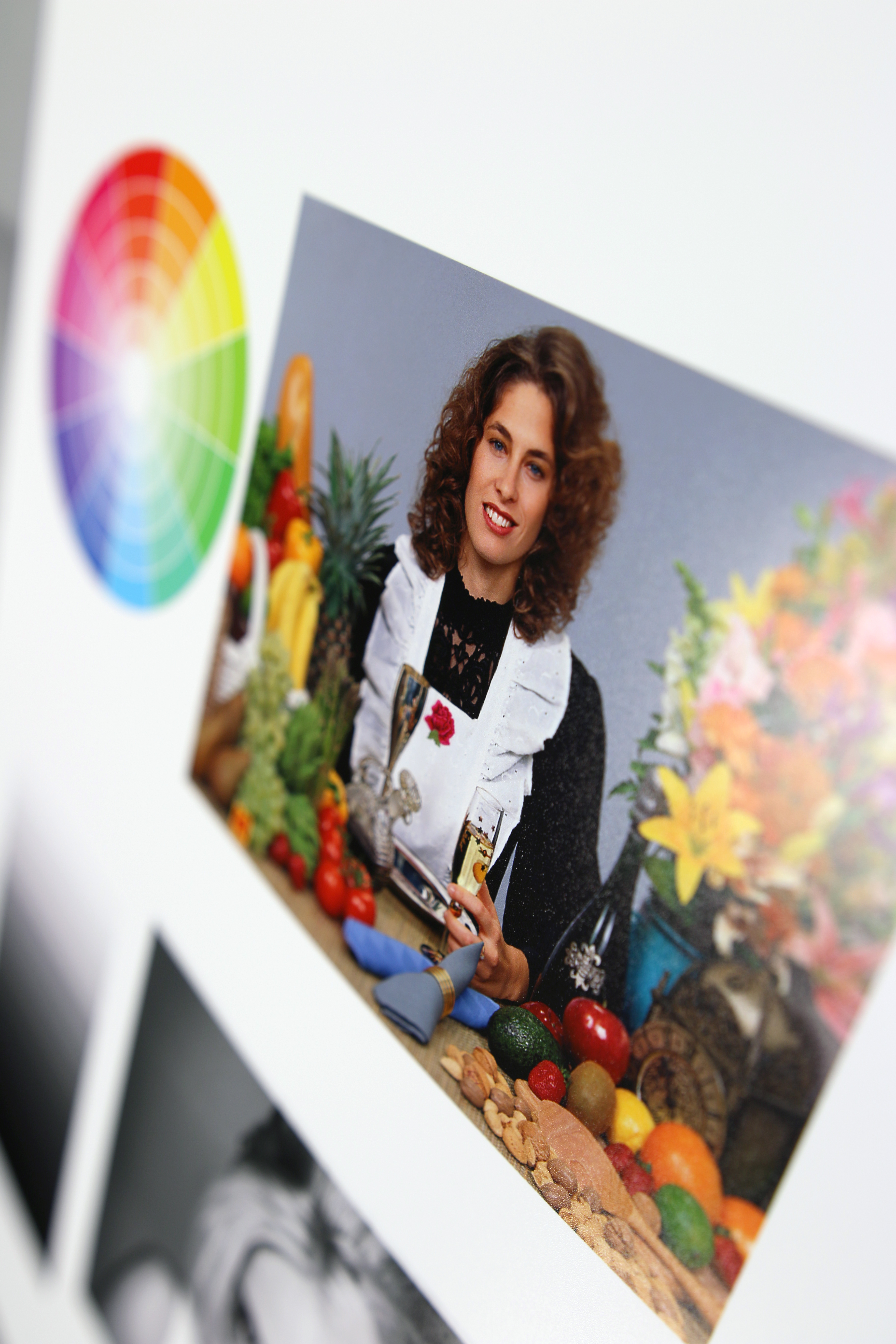
Examples of test sheets
One of the changes that have been made with the newest line is that the new Ilford Gallerie is a thicker paper, 310 GSM, versus its thinner predecessors, 190-280 GSM. This added thickness has given the paper an additional weight for the photograph that easily transcribes as a photograph to be a cherished object versus the cheaper stocked papers that are flimsy and can even wave under the weight of the thickest areas of ink. The thickness has changed but the names and finishes are the same so if you were in love with Ilford before, Ilford will have you loving the new line even more.

So for the testing I printed my test images via the Epson SureColor P7000 and for each print I documented the Name of the Paper, the Finish, the printing Quality chosen, ICC Profile used, and the Program used to print through. It is important to document as many notes as you can with your printing process so that if at any given moment you will be able to recreate the exact print that you desire. What I am looking at is the Weight of the paper, Brightness, Finish, and Opacity (can light pass through the paper). These particulars of each paper are going to play into how the image is printed and how the display of the photograph can influence the viewer. Listed below are the Ilford Gallerie Prestige Papers that I was able to test:
Smooth Pearl: a favorite of Ilford Master Eddie Horstman
- 99% Opacity
- 310 GSM
- No curling under ink pressure
- Luster/Pearl Finish
- Easily holds a heavy black but not a full Glossy to take away from the beauty of the paper and image
- Sharp Contrast
Smooth Gloss:
- 99% Opacity
- 310 GSM
- No curling under ink pressure
- Gloss Finish
- Easily holds a heavier black but slightly darker hues than the Smooth Pearl, you may need to adjust.
- Sharp Contrast
Gold Fibre Silk: a favorite of Ilford Master Elinor Carucci
- 98% Opacity
- 310 GSM
- Baryta Inkjet Paper
- No curling under ink pressure
- Luster Finish
- Due to the true baryta layer the paper has a slight warmtone and thus produces lively skin tones.
- Sharp Contrast
Gold Mono Silk: a favorite of Ilford Master Gregory Heisler
- 99% Opacity
- 270 GSM
- No curling under ink pressure
- Luster Finish
- Less warmtone than the Gold Fibre Silk and beautifully maintains image quality.
- Sharp Contrast

Prestige Cotton Artist Textured:
- 98% Opacity
- 310 GSM
- No curling under ink pressure
- Watercolor Paper Texture/Matte
- A little loss of detail in the blacks due to the texture of the paper, but a beautiful fine art paper.
- Softer Contrast
Prestige Gold Fibre Gloss:
- 98% Opacity
- 310 GSM
- No curling under ink pressure
- Smooth Fine Art Paper
- Baryta-like surface so a slight warmtone but less than the Gold Fibre Silk
- Beautifully holds depth within the blacks, grays, and whites. It is a little heavy handed with color and so slight adjustments may be needed to open up midtones.
- Sharp Contrast
Prestige Textured Cotton Rag: a favorite of Ilford Master ReD Ognita
- 98% Opacity
- 310 GSM
- No curling under ink pressure
- Textured Fine Art/Matte (less texture than Prestige Cotton Artist)
- A little loss of detail in the blacks due to the texture of the paper, but a beautiful fine art paper.
- Softer Contrast
Prestige Smooth Cotton Rag: a favorite of Ilford Master John McDermott
- 98% Opacity
- 310 GSM
- No curling under ink
- Smooth Fine Art/Matte
- Saturated colors and a little loss of details in the blacks so adjust accordingly. Perfect for a matte finish with little distraction due to the smooth finish instead.
- Sharp Contrast
From testing the various papers I immediately fell in love with the variety I had to choose from. Depending on my image I have the option for papers with a slighter warmer tone, or softer contrast, a textured finish, or even more saturated colors. With all of these options at my fingertips it is easy to get excited about printing again and furthering my photographic practice with the exploration of different types of paper. My top favorites are the Gold Fibre Silk and the Gold Mono Silk. Even though I prefer a matte finish, the warmtone to these papers quells any concerns I have for the finish and the range of detail that I can pull from the blacks adds extra depth to any image.
Though I have my preferred favorites I can honestly say there is no bad paper to choose from in this line and given the specific photographic project I could easily and confidentially choose any of the Ilford Gallerie Prestige line to produce gallery quality prints. With sheets ranging from .99 cents to $1.79 Ilford is a very affordable paper with high-end quality and with their sample packs for only $24.95 everyone should be testing Ilford for themselves. So hopefully everyone will be excited about seeing their work in print and Happy Printing!
Angela Smith is the MPEX Imaging Specialist, so drop her a line if you have any questions about Ilford paper or printing at imaging@mpex.com!